Archive
Snapshots of my current and previous site designs. Seems like I have a habit of redoing it every year. Sometimes you gotta keep renovating the house!
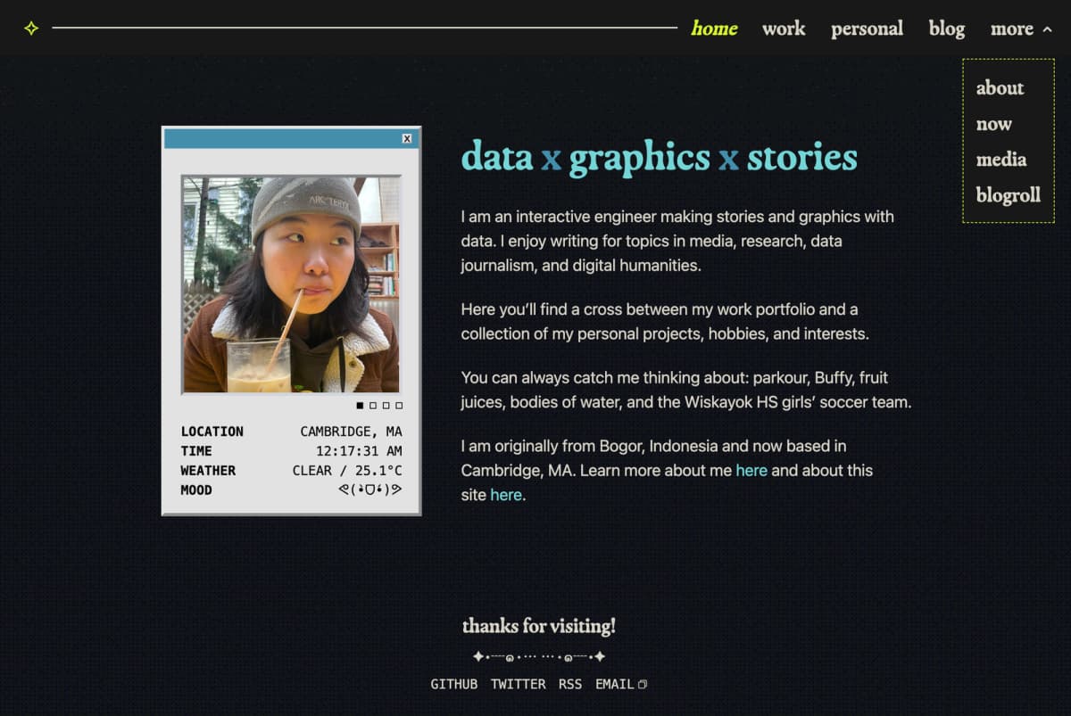
First legit version
This is the most comprehensive build by far. I switched from deplyoing on gh pages to vercel using secret env variables. the first one styled primarily with tailwind instead of vanilla CSS. game changer.
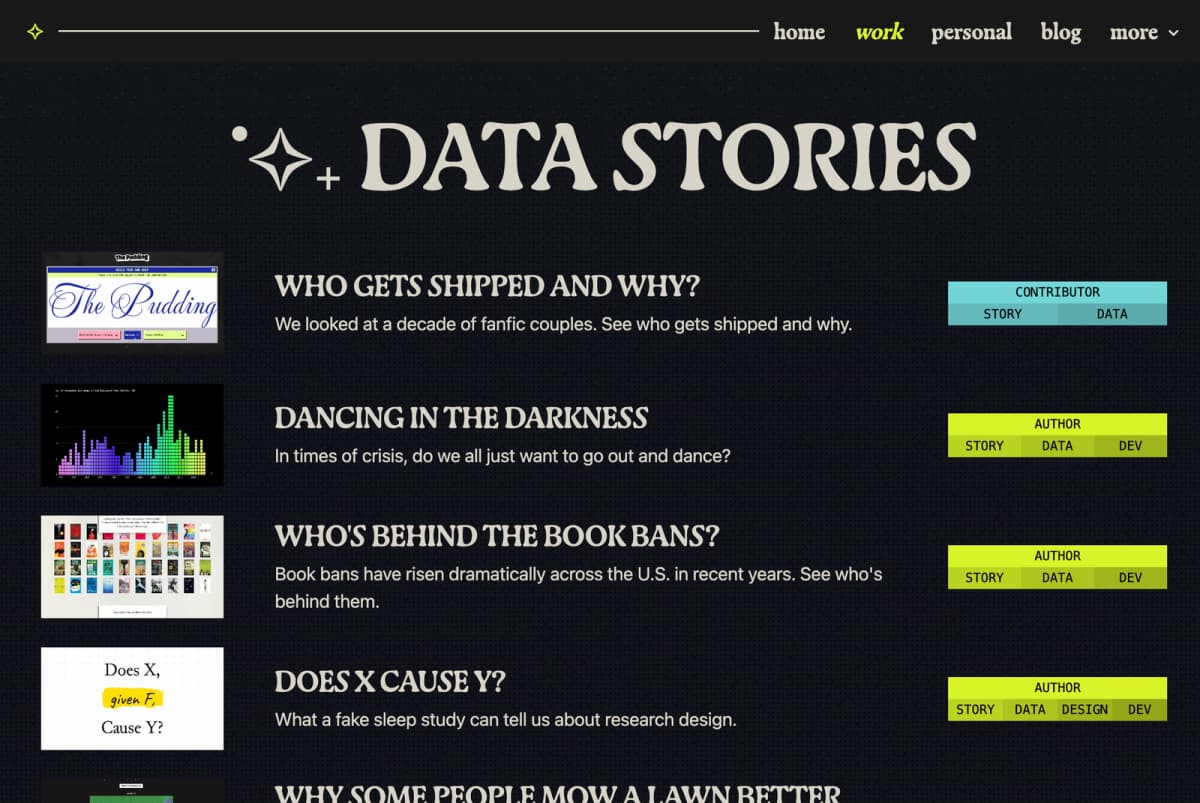
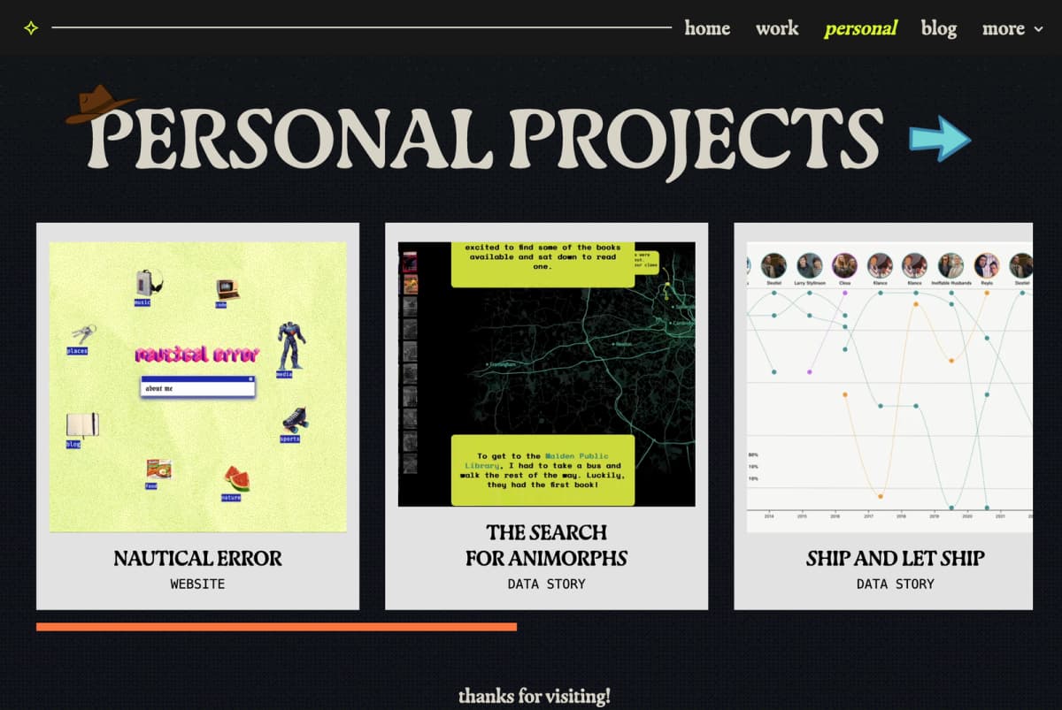
test
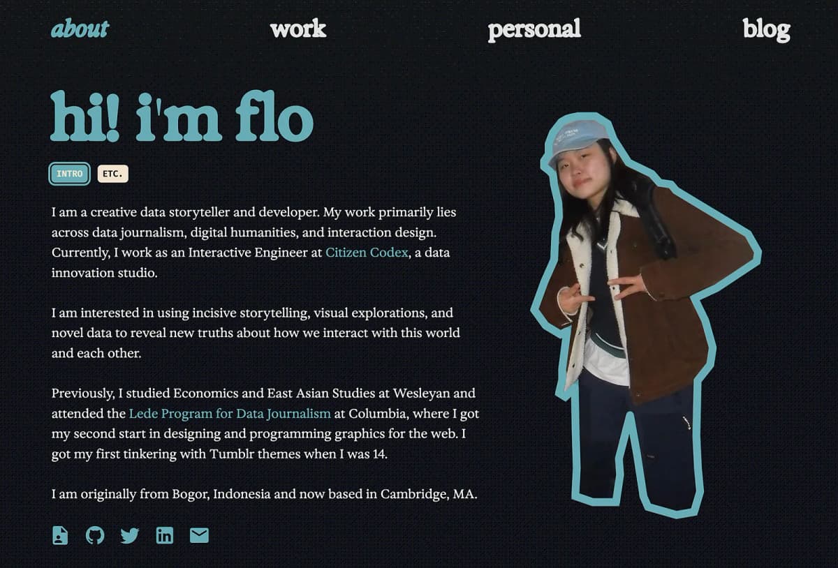
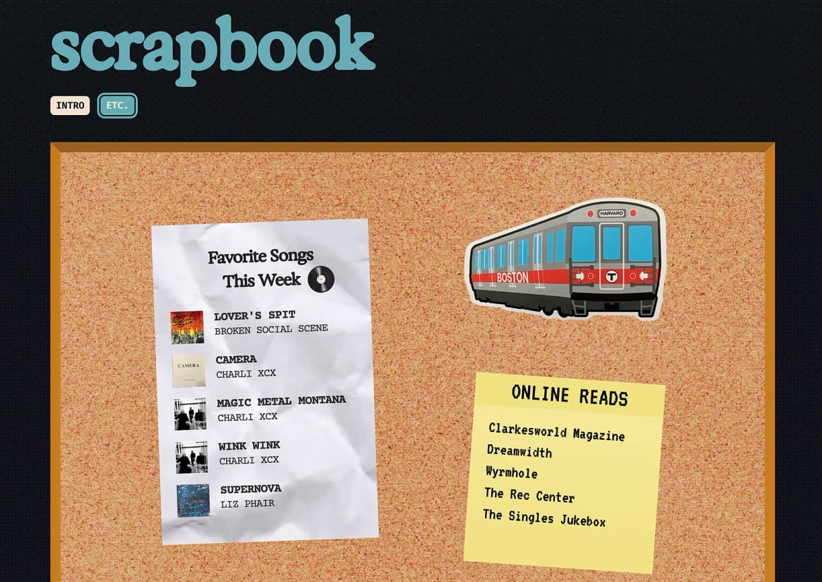
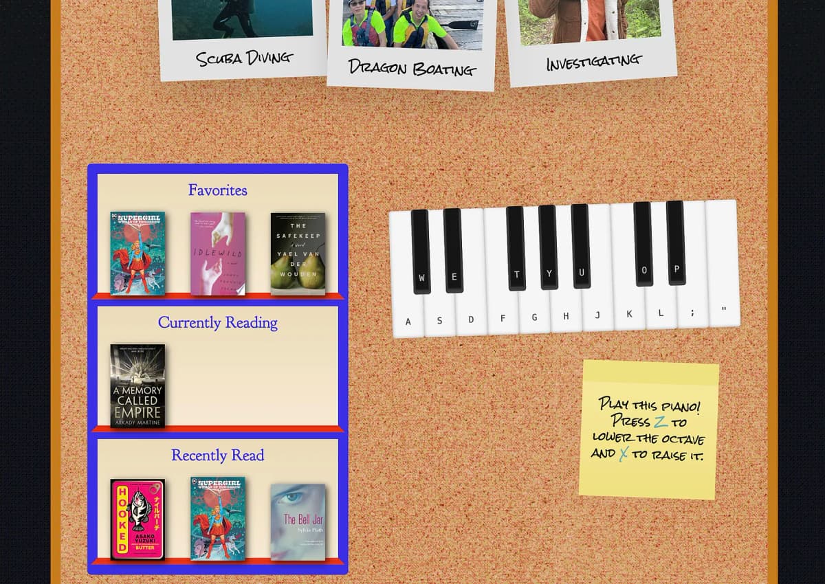
Placeholder
test
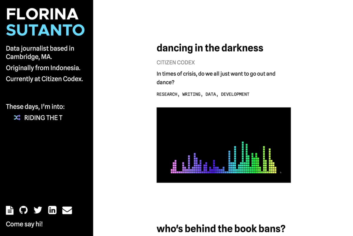
Somewhat better portfolio
test
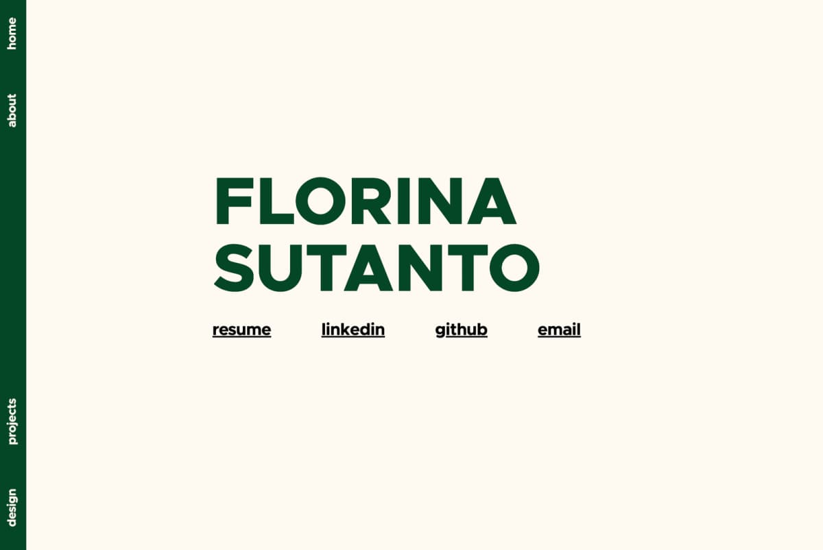
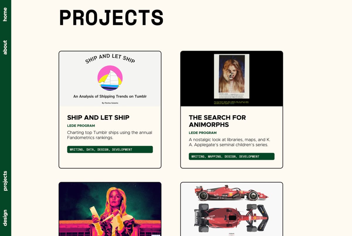
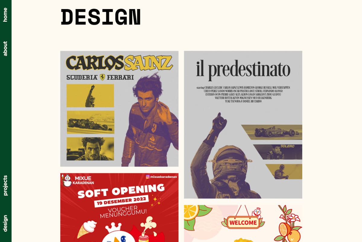
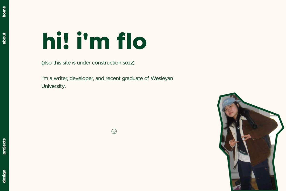
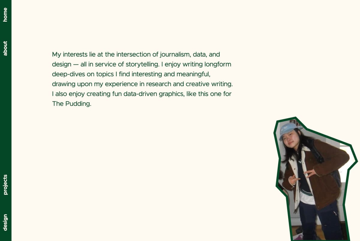
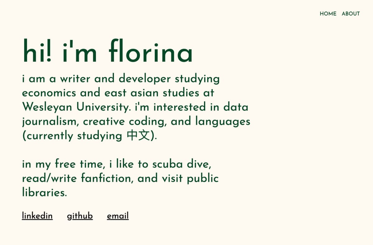
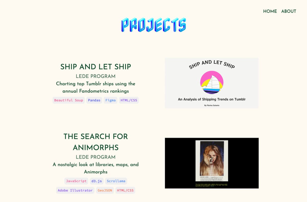
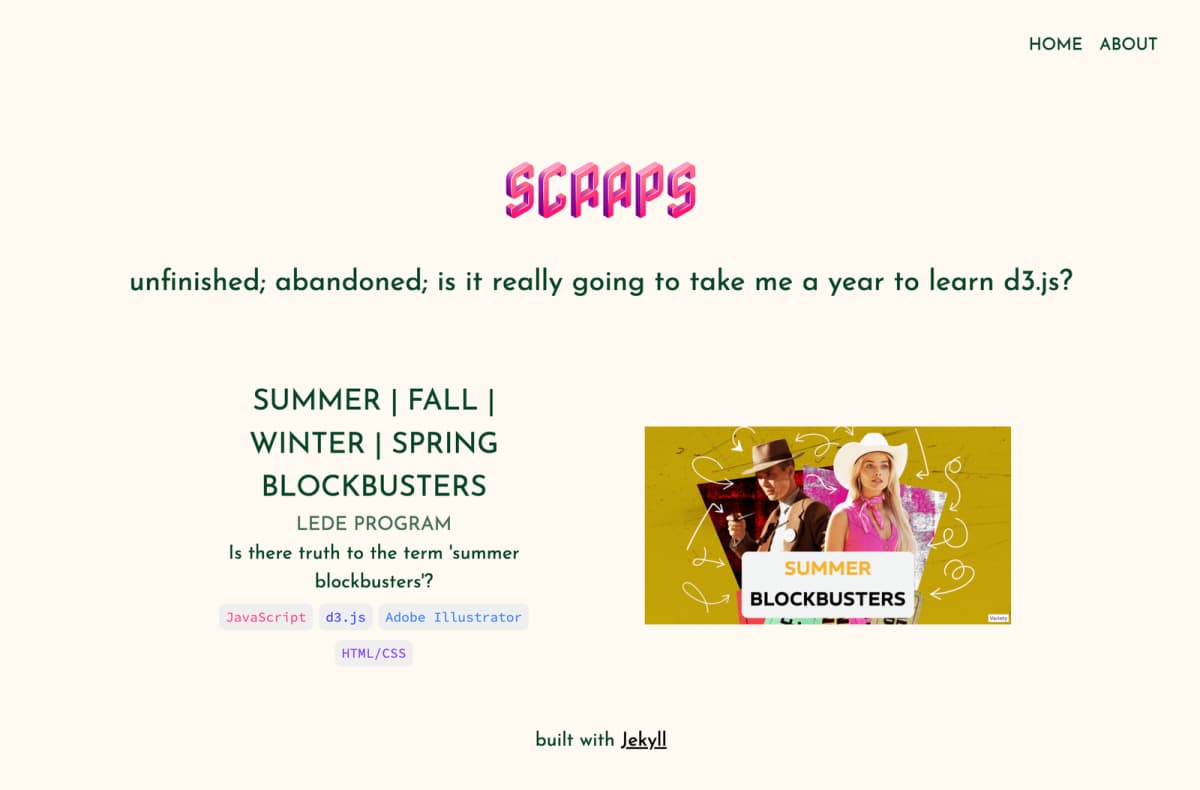
Original portfolio
I built this by reskinning this Jekyll theme. In retrospect, I have no idea why I did that — I’d never written Ruby or Liquid before and distinctly remember having a miserable time trying to wrap my head around the architecture of the template. It was such an overengineered approach for what could’ve easily been two html files and one css file. I probably saw a tutorial for deploying a Jekyll site on Github Pages and thought I’d at least learn something new by being elbows deep in it.
I considered using a website builder like Squarespace or Wix but ultimately did not want to take the easy route; I wanted to come out of my winter break having built a portfolio site ‘by hand’, even if it didn’t look polished. And like, it was definitely crude, the colors clashed, and there was NO responsiveness to speak of because this was before I learned how to style for mobile, so it looked like a hot mess on anything smaller than tablet size
I love the colorful, isometric look of the Nabla font for the headings and have tried to reuse it in other projects, but unfortunately it still isn’t supported by Safari or iOS, so the color fill won’t render.